Applications Configuration
You can learn more about App Configurations in the Overview ⟶ Concepts page.
Creating App Configurations
The configuration variable names and values are defined in the Application's app.yaml file as configuration.
Configurations can also be optionally defined in the ui_schemas that provides a link to a JSON file containing all the information about how to display Configurations in the Kelvin UI.
Note
Operations will have the option to change these at runtime from the Kelvin UI.
Note
If you use the Data Types, then a full list of Data Types is available at overview concepts page here.
| app.yaml Example | |
|---|---|
For the configuration.json file you can define all the information for the Kelvin UI — the display label, helper text, input type, value constraints, and UI behaviour for each configuration field.
UI Components
Each configuration field is defined inside properties with a set of keys that control how it appears and behaves in the Kelvin UI:
"broker-port": {
  "type": "number",
  "title": "Broker Port Number",
  "description": "Port number the MQTT broker listens on",
  "minimum": 0,
  "maximum": 65535
}
| Key | Options | Description |
|---|---|---|
type |
string, number, integer, boolean, object, array |
The data type expected from the user. Controls the default input rendered in the UI. |
title |
Any string | The label displayed next to the input in the Kelvin UI. |
description |
Any string | Helper text shown below the input to guide the user. |
minimum |
Any number | Minimum accepted value. Applies to number and integer types only. |
maximum |
Any number | Maximum accepted value. Applies to number and integer types only. |
Mandatory Fields
You can define which UI components must have a value before the user can save and apply the configuration. Any field listed in required will block saving if left empty.
UI Features
Advanced Widgets
By default each component uses the standard input for its type — a text box for strings and numbers, a toggle for booleans, and so on. Advanced widgets let you override this with a more appropriate control.
To use an advanced widget, define the component under properties as normal, then add an entry for it under the x-kelvin-ui key specifying the widget to use. For example, to mask an API key as a password input:
| Widget | Description |
|---|---|
password |
Masks the input value. Use this for sensitive fields such as API keys and passwords. |
Note
Additional widget types will be documented here as they become available.
Component Order
By default, components are displayed in the Kelvin UI in the order they are defined in configuration.json. You can override this by specifying a custom order under x-kelvin-ui:
Any fields not included in ui:order are displayed after the listed fields in their original definition order.
Get Configuration Values
This is how to access the global configuration variables in a Application:
| Get Configuration Values Python Example | |
|---|---|
Info
app.app_configuration will only be available after app.connect()
You can also get nested App Configuration values;
| Get Nested Configuration Values Python Example | |
|---|---|
Updating Configuration Values
Developers and Administrators can update these values through the Kelvin API without needing to re-upload the complete Application or Kelvin UI.
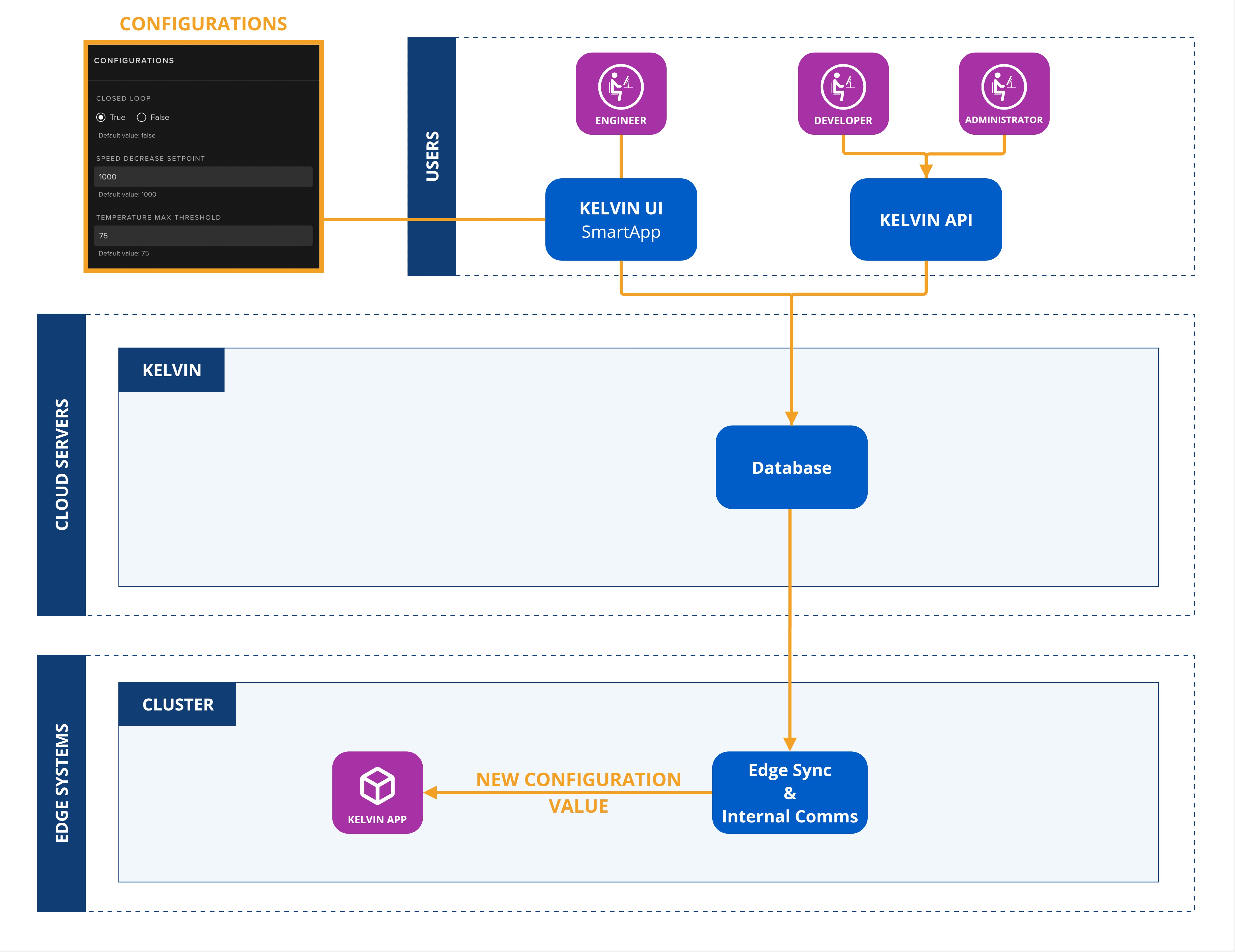
To update the configuration values dynamically, you use the Kelvin API endpoint /workloads/{workload_name}/configurations/update.
Note
The configurations values are applied directly to a workload. This will not affect the values in the App Registry.
If you have a Application deployed as many workloads, the updates will only affect the workload you target.
Upgrading Applications
When a Application is upgraded, Kelvin automatically propagates all matching App Configuration values from the previous version to the new version.
For any new App Configurations introduced in the upgraded Application version, the default values will initially applied to the Workload.